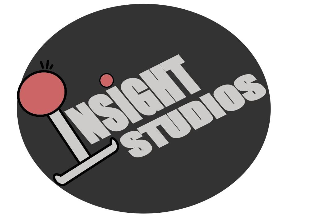
When i was brainstorming for my initial logo idea i needed to figure out how i wanted to lay out the image so that i could begin designing it. I looked at 7 different types of logos and how they’re used. From doing this, i knew that i wanted to incorporate a Pictorial mark (symbol) but combine it along side with the brand.
With the company being heavily related to game development i chose to use imagery symbolic of retro gaming, such as a controller or joystick.
The name i came up with was Insight Development. The definition of Insight “the capacity to gain an accurate and deep understanding of someone or something.” Is quite fitting with what a game development should strive for, that’s the sort reasoning behind the name, not that its really necessary.
When i was looking at images of Joysticks i noticed how some designs are shaped liked the letter I, I took this into mind when i planned out how my logo was to look when i brainstormed it on paint.
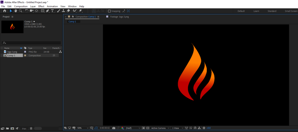
Final Outcome:
Overall im please with outcome, it captures what i brainstormed originally and the Joystick logo works well as both a dropped capital, and as a brand logo/mascot.
Color Scheme:
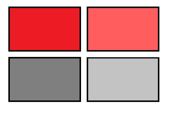
As soon as i began looking at different vector images for Joysticks and controllers i already had a pretty clear understanding of what my main two colors were going to be. In the end i went for a light grey and light red.
The squares on the right was what i had settled with on my original design but after i recreated it i decided to go for a lighter shade of both of these colors and add a black outline on the shapes.
FONT
When i decided to go with the Impact font i was looking for a way to make it bold, so in the end i applied a stroke which was the same color as the font and upped the stroke value until i was happy with the outcome of it.
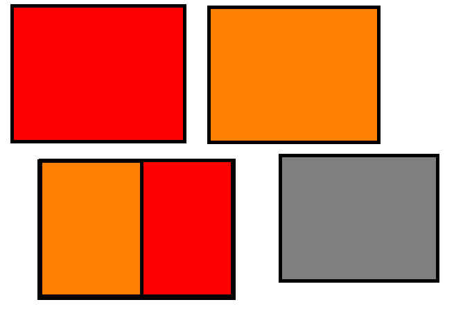
I already had in mind what i wanted to use for my logo but i wasn’t sure what color scheme to go with. I wanted to contrast my logo against the background to emphasize it as a focal point of my design.
Color scheme
As the logo is a flame, orange and red worked perfectly, this together with the grey created the contrast i was looking to achieve.
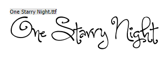
Experimenting with different fonts
After i was happy with my color scheme and had animated the logo i needed to choose a fitting font.
Firstly went on Dafont.com as i was looking for a modern font, mainly due to the fact that the logo i selected was stream lined and simple. I couldn’t for example use a font like “One Starry Night” as it didn’t match what the logo portrayed what so ever.
After some time i was stuck to choose between either “Blacklisted” or “Impact”. I put both the fonts onto the logo and the better choice became apparent quite quick.
Screenshots taken from the end frame of the logo animation.
I chose the “Blacklisted” font as i preferred the sleek letters and the arrow cutting across the text.
I had very little experience with using After effects before. However prior to this task Id used other video editing software before so the layout of after effects wasn’t too foreign to me and it didn’t take me too long to get used to the different widows id be required to work between.
Understanding the basics of using simulation effects:
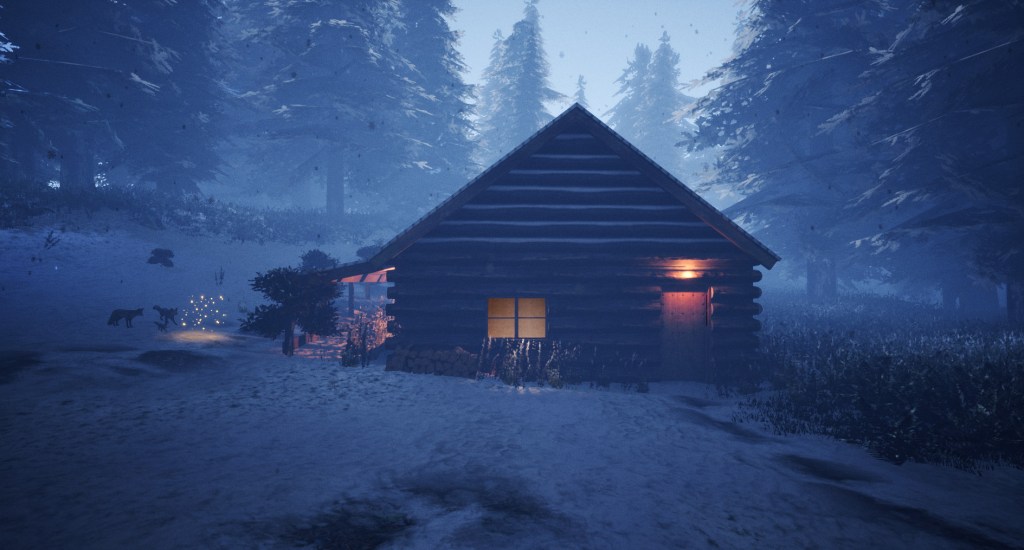
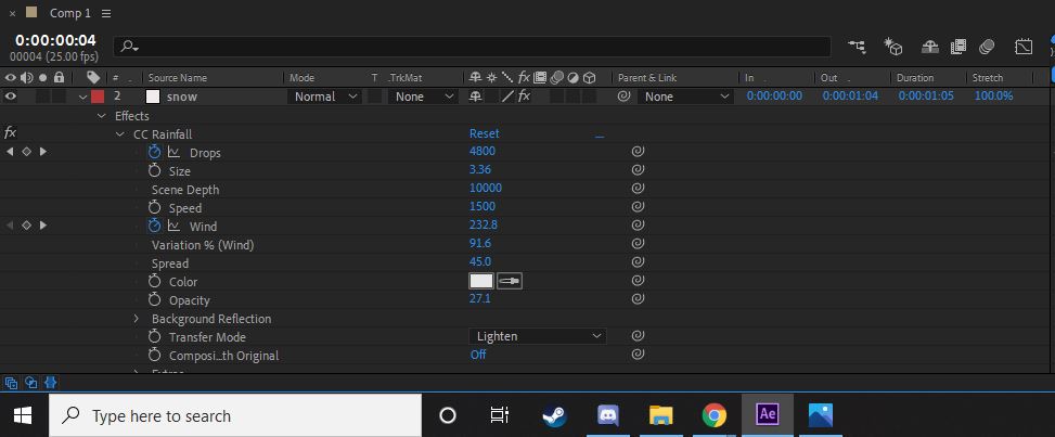
I wanted to use the simulation effects to create an animated winter scene. I got an image of a cabin and imported it into after effects.
On the effects tab there was both a rainfall and snowfall effect, i preferred the visuals that i could get out of the rainfall effect so all i had to do next was experiment with the different settings.
It took a lot of trial and error to get the effect i really wanted but in the end i was pleased with the outcome.
Logo creation/animation:
To begin with i selected a basic image from google which i could use as a base for my logo, all i needed was something simple to work with.
I wanted to get a logo with bright colors, so that i could contrast it against a darker background.
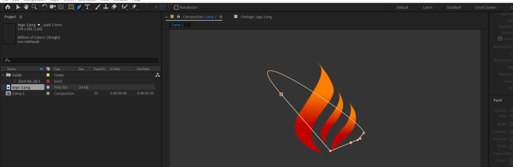
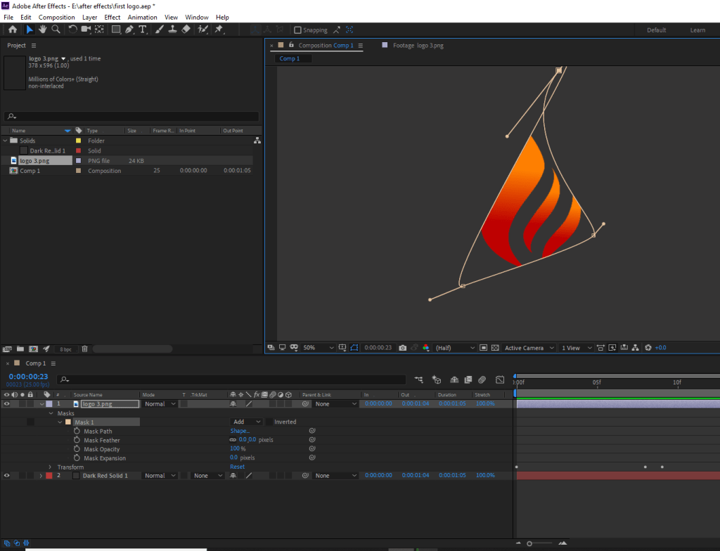
After this i then wanted to change the shape of the flame, so i used the pen tool to create a mask, i found this pen tool similar to the one i had used in Cinema4D previously.
I moved the lines around until i was happy with the new change.
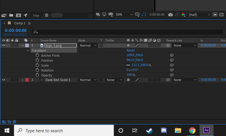
Then i needed to animate the logo, i started by changing the opacity values, but i kept it at 100% as it worked better against the grey background. I did the same with the rotation and scale values until i was happy with the outcome.
I wanted to add some text to the logo so that it appeared as a branded image. I chose the word Ember as it has connotations to fire and works well with the flame image i selected.
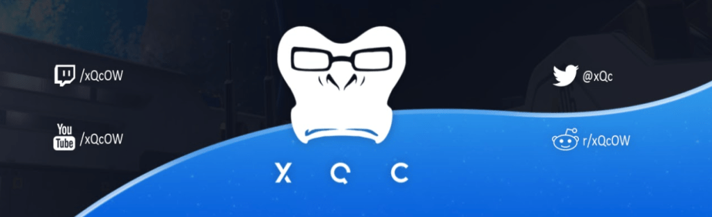
Félix Lengyel, better known by his online alias xQc or xQcOW is a French-Canadian Twitch streamer and Internet personality.
Making a name for himself during his rise in competitive Overwatch, landing himself a spot on Dallas Fuel as main tank. Having also played for team Canada competing in all 3 of the OW World Cups (2017,2018 and 2019.) He without a doubt left an impact on the community, being argued as one of the best during his short lived pro career.His pro career ended abruptly due to his “repeated controversy” over the span of a few months, all this controversy around his name at the time finally resulted in him being suspended from the Overwatch League and dropped from his position in the Dalas Fuel.
With all this publicity around him at the time xQc used this to really kickstart his twitch career. It wasn’t uncommon for Félix to spend anywhere between 12-16hours daily streaming mainly just Overwatch in the early months of his streaming career, but now he mostly plays a variety of games on his twitch channel, his main and most streamed category isn’t Overwatch, in-fact its “Just Chatting”, being included at the start of almost every stream. He spends his time in the “Just Chatting” category reacting to fan made content, videos and recently opening items he receives in his PO Box. His reactions and content created on streams are then cut, edited and uploaded to YouTube establishing its own mini series on his channel xQcOW.
Since streaming xQc generates his revenue in a variety of ways, whether it be from monthly twitch subscriptions from viewers, sponsored streams from game developers, adverts which play before watching his channel if you’re not subscribed to him and finally the most notable donations, there are 2 main types of donations Félix receives on stream. Because donating allows for fans to write personalised messages directly to xQc via a text to speech bot, it didn’t take long for this to abused by his viewers, using it to spam who spam the 3 dollar TTS bot with spam and comments which cause chat reaction or just tilt Félix even more, seeing xQc rage and smashing his desk on stream happens daily resulting in him then yelling in a blend of French and broken English. Seeing him act like this isn’t a rare occurrence, just ask his long time or regular viewers.
Having amassed over 2 million followers on Twitch and 600k+ subscribers on his personal YouTube channel, his target audience is quite varied based on what he’s streaming at the time, although mainly his audience is anywhere between 15 and 25 years old, yet his content isn’t limited to this.
The main branding for both is Twitch and Youtube is largely based upon Winston, a hero from the game Félix used to play professionally. His logo is quite subtle and simple, which is the complete opposite to his personality and stream environment.
Compared to most streamers of his size and calibre, Félix doesn’t stream from a flashy office or have highly produced animations and overlays, he’s kept his stream near enough the same as when he started years ago in his bedroom, to this day most of xQcs daily streams he streams from his bedroom which allows for his fans to be able to relate to him, unlike other streams such as Ninja or DrDisrespect who have green screens, full production teams, animations etc etc.
Felix Arvid Ulf Kjellberg, known as PewDiePie online is a Swedish YouTuber and online personality. Felix is the creator of the most subscribed YouTube channel to date, having earned over 103 million subscribers, placing him king of YouTube, since he started in early 2010 he has accumulated over 24 billion total video views in just under 10 years.
Its no lie that Felix is generating his main income from his YouTube, from advertisements placed before, during and after his videos. Yet he has other avenues of income, such as his clothing drops and merch store, not to mention the mobile phone games he’s had part in developing, such as Tuber Simulator, a game which fans can get a deeper understanding of what its like to be a content creator in their own virtual world, starting from scratch with no subscribers or influence as Felix did back in 2010.
Promotion wise Felix’s presence is felt allover the internet, having a thriving communities on twitter, instagram, reddit- the list goes on. Everyone who needs to know about PewDiePie pretty much already does so in terms of growth its pretty much just natural for Felix’s whole brand now. His styles of videos has really progressed over the years, changing from a game lets play channel to a sit down, comedic channel where most of his videos include fan interaction on his reddit or twitter.
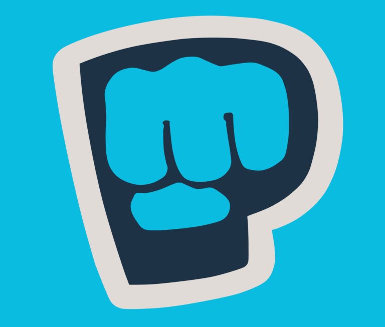
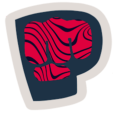
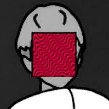
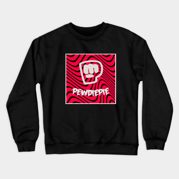
The PewDiePie brofist is the main staple of his brand, with him using it as his old logo and outro for his videos, it was a way for his fans to interact with him just before the video ended. The PewDiePie logo has evolved and grown as his channel has with some of the most noticeable changes being..
The second and third logo changes quite commonly appear in PewDiePies merch drops, being featured here for example.