When i was brainstorming for my initial logo idea i needed to figure out how i wanted to lay out the image so that i could begin designing it. I looked at 7 different types of logos and how they’re used. From doing this, i knew that i wanted to incorporate a Pictorial mark (symbol) but combine it along side with the brand.
With the company being heavily related to game development i chose to use imagery symbolic of retro gaming, such as a controller or joystick.
The name i came up with was Insight Development. The definition of Insight “the capacity to gain an accurate and deep understanding of someone or something.” Is quite fitting with what a game development should strive for, that’s the sort reasoning behind the name, not that its really necessary.
When i was looking at images of Joysticks i noticed how some designs are shaped liked the letter I, I took this into mind when i planned out how my logo was to look when i brainstormed it on paint.
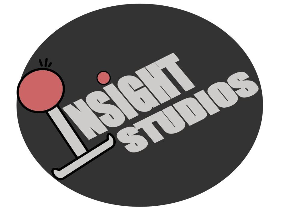
Final Outcome:
Overall im please with outcome, it captures what i brainstormed originally and the Joystick logo works well as both a dropped capital, and as a brand logo/mascot.
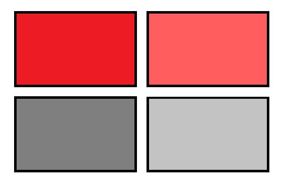
Color Scheme:
As soon as i began looking at different vector images for Joysticks and controllers i already had a pretty clear understanding of what my main two colors were going to be. In the end i went for a light grey and light red.
The squares on the right was what i had settled with on my original design but after i recreated it i decided to go for a lighter shade of both of these colors and add a black outline on the shapes.
FONT
When i decided to go with the Impact font i was looking for a way to make it bold, so in the end i applied a stroke which was the same color as the font and upped the stroke value until i was happy with the outcome of it.
