I already had in mind what i wanted to use for my logo but i wasn’t sure what color scheme to go with. I wanted to contrast my logo against the background to emphasize it as a focal point of my design.
Color scheme
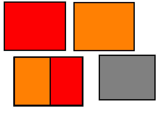
As the logo is a flame, orange and red worked perfectly, this together with the grey created the contrast i was looking to achieve.
Experimenting with different fonts
After i was happy with my color scheme and had animated the logo i needed to choose a fitting font.
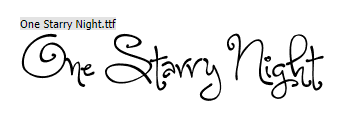
Firstly went on Dafont.com as i was looking for a modern font, mainly due to the fact that the logo i selected was stream lined and simple. I couldn’t for example use a font like “One Starry Night” as it didn’t match what the logo portrayed what so ever.
After some time i was stuck to choose between either “Blacklisted” or “Impact”. I put both the fonts onto the logo and the better choice became apparent quite quick.

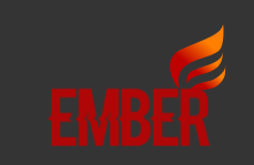
Screenshots taken from the end frame of the logo animation.
I chose the “Blacklisted” font as i preferred the sleek letters and the arrow cutting across the text.
