
- Showcases the development company and producer.
- Bold title.
- Imagery of good vs evil in the background.
- Same blue neon eyes on the robots and character seen on the left, signifying evil?
- Bright colours mixed with washed out tones to create a contrast,drawing attention to the text.
- Cover being used to tell a story.
- Chaotic

- Pegi 18, shows intended target audience.
- Serious glare, focused
- Game title in large font, taking up most of the space
- Modern weapons=modern war game
- Initials of game’s title in background.
- Faded imagery of a burning tower surrounded in ashes and flames.
The first cover i chose is from Borderlands 2,having played all of the Borderlands series i already had an understanding of what its target audience would expect from a looter shooter title, that title being Borderlands 2 in this case. The Borderlands collection as a whole shares a signature hand drawn comic book style textures combined with very thick outlining shaders. This art style is commonly referred to as “cel shaded”. Since the first borderlands title release back in late 2009, to its latest release in 2019 its kept the art style similar throughout.

The Borderlands series is very bright and colorful, hence why i decided to use one of the Borderlands 2 promotional posters as an example in this unit as i felt it would make for a good comparison to a darker poster or cover.
The game poster uses vibrant colors to highlight key information within the image and to feature game characters (whilst also displaying the fight between good and evil.In my opinion this has been used to foreshadow the battles within the later parts of the story.to the potential new audience. This is very important for a game like Borderlands 2, with it being the second installment in a heavily story driven franchise it is key that new players don’t feel uninvited to play it just because they’re unaware of some of the characters in Borderlands 1 or how the game will build upon Borderlands 1s story. Although these might seem like small details, showing this on the poster is vital so that the game can draw in a new player base, and obviously it worked, Borderlands 2 became the game of the year in 2012, and by 2014 8.5 million copies had been sold – this broke 2k games record in sales.
The other cover is almost a complete opposite to the previous one visually, because of the genre of the game being a realistic first person shooter. The main color choices,consisting mainly of dark blue, grey and black target its male audience predominantly. The character taking up this posters identity is hidden, much like how in the military names and identities are hidden. Both game covers have a character of unknown importance taking up a good majority of the image, these characters are used mainly to draw in attention, with the surrounding text or imagery actually explaining whats going on or giving key information such as release dates, age rating or the game title itself.
Task 2 – Creative Response
Cinematography Worksheet
Cinematography is a term used to describe all aspects of camerawork: shot types, camera positioning, camera movement and framing.
The cinematography choices made within visual media are a key means by which the filmmaker can convey meaning.
Define the following shot types and comment on their impact for the viewer/player
| Shot type | Definition and impact on viewer Example and screen shot from a game. |
| Extreme close-Up | A shot taken of a subject or object at close range that shows the subject or object in greater detail. The shot is tightly framed and is regularly used to frame a character’s face in such a way that it fills the screen. An extreme close up will make a viewer or player enter a character’s personal space, showing a character’s emotions and traits which could otherwise go unnoticed. Using an extreme close up gives the viewer/player no choice but to experience the c current shot. |
| Close-Up | In the close up shot, a specific feature or part of the subject takes up most of the frame. A close up of a person usually means a close up of their face. A close up of the face allows viewers/players to feel a character’s current emotional state. |
| Medium Close-Up | A medium close up shot is done when a filmmaker places their camera so that a character is framed from right above their head down to their torso. The shot still allows for a character’s emotions and facial expressions while also keeping some of background in shot. Similarly, to the previous two shot types, it allows the audience to whiteness facial expressions and emotions. |
| Medium Long Shot | A medium shot is a kind of camera shot in TV and film that shows an actor approximately from the waist up. A medium shot is used to emphasize both the actor and their surroundings by giving them an equal presence on screen. This sort of shot can bring a viewer into a scene with the characters. |
| Long Shot | A long shot shows the subject from top to bottom, it usually serves as an establishing shot. These shots are taken from head to toe, allowing the scenery to take up most of the frame instead of an actor or game character. Allows an audience to acknowledge their whereabouts in a scene. |
| Extreme Long Shot (Also called Establishing Shot) | An extreme long shot is similar to a long shot. However, the shot covers a wider area.The shot frames the subject from a distance and focuses on its surroundings.These shots can be used to inform an audience that characters are moving from one location in a scene to another. |
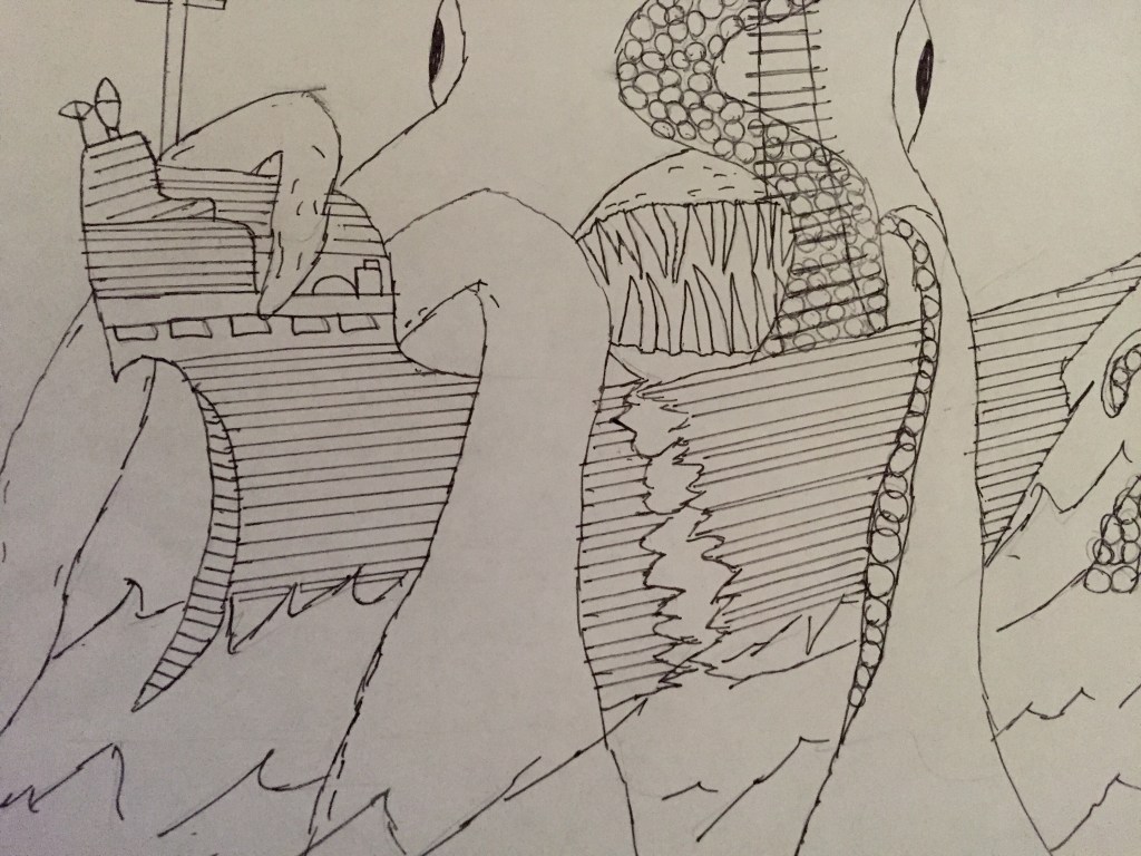
Before i began drawing my poster i remembered back to one of my initial FMP ideas, sea monsters. I knew that the sheer size of some of these creatures would work well for a poster as i could mix both close up shots of the creature with some longer ranged shots. I did this to highlight how hopeless mans creations would be in a situation like this.
My next step is to add colour and details.
-Granted im not very good at drawing with a pen and pencil, im happy with the outcome of this piece mainly because i feel like it achieves what i wanted it to. My main reason behind choosing to create an image like this is so it develops the back story for one of my original FMP ideas, the ship being attacked by a large kraken like sea monster is why the character would’ve been stranded on the island, this is of course if i decided to go with this idea.
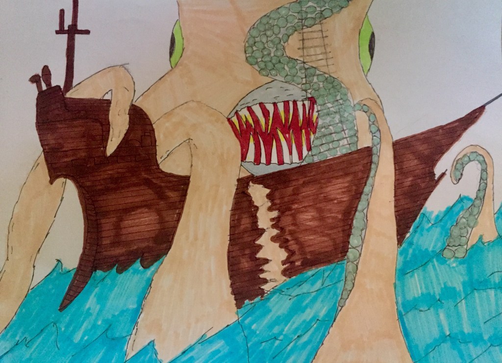
I tried to recreated this image on Adobe Illustrator, but because it was my first time using the program and the fact that i had to draw with my inaccurate mouse, i just decided to stick with pen and paper.
